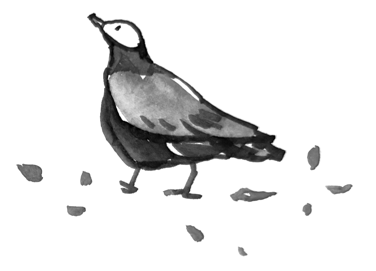
The Center of Gravity in Design
Designs that make us feel, “There’s something good about this,” probably have a particular center of gravity.
It is something like an overall balance—something that cannot quite be explained by individual elements such as color, type, photography, or illustration.
In terms of its visible elements, the Feel & Interface website is quite simple. A warm background with clear black type. A single drawing of a bird accompanies each article. There is little decoration, and the layout is not especially complex. It has an unfinished presence, with some roughness left in it. I want to take my time deciding whether to add something more, or perhaps take something away.
Even so, it took a fair amount of trial and error to arrive at its current form.
Make the type just a little larger, and this small personal publication begins to feel too imposing. Make it too small, and it starts to look affected. Lighter text or thinner strokes feel insubstantial. A warm background paired with cool-colored type looks beautiful, but somehow not quite honest.
Tight letter spacing feels too serious. A typeface without much expression does not suit this writing. Put the navigation in a horizontal row and it feels ordinary. Add too much of a hover effect and it starts to feel overdone. And just because this is a publication about AI, using AI-generated illustrations would be far too predictable to be interesting. And so on…
None of these choices is wrong in itself. They are simply the small decisions I have made for this particular website.
A tiny adjustment shifts the center of gravity of the whole thing, little by little. Design often feels like doing this endlessly: the quiet work of searching for a point only I can recognize—“Ah, yes. Right about there.”
To change the subject slightly, digital product design has something called a “design system”: a way to make UI parts easier to reuse and to maintain consistency across a product.
Once a set of rules exists, a designer no longer has to reconsider everything from scratch each time. The character of a product can be reproduced to some degree. It is an effective way to work faster and maintain a baseline of quality.
Of course, using a design system does not produce good design by itself.
Before a system can exist, there must have been an accumulation of many decisions. How much space should there be? How strongly should the type assert itself? What colors balance the character of the brand with usability? Rules come later, after questions like these have been considered together and tested many times. It is generally difficult to build the system first.
And when we intentionally set out to make something unlike what came before, following existing rules alone cannot produce a great leap. Sometimes we need to think outside them.
I suspect this remains essentially true now that AI, as well as people, has begun designing with reference to sets of rules.
At least as of 2026, AI can follow given instructions reasonably well and reproduce something that looks the part. It can make many things quickly, and may even maintain a degree of consistency more precisely than people can. Every so often, it also produces something unexpected enough to make me think, “Oh, I hadn’t imagined that possibility.”
But where are we trying to go in the first place? Which of all those options should we choose? How do we judge the quality of the details, and what do we do once we have? It seems to me that these questions still call for human judgment.
Or perhaps it is less a question of whether human judgment is necessary. More honestly, it simply would not be interesting if our intentions and individuality were absent from those decisions.
There are many situations where something made efficiently from what has already been learned to be “good”—something that looks more or less right—is quite enough. I do not deny that at all. But a world filled with nothing else would not feel particularly rich.
To proceed one decision at a time, with intention and close attention. The repetition of that act is probably at the root of design.
The bird at the beginning of this article was painted with a brush and watercolor. I am not trying to draw skillfully. If anything, I want to leave the slightly uneven lines and bleeding color as they are.
As I make more things together with AI, these birds feel like small signs that my own intentions were unquestionably involved.
I use Codex for vibe coding, and ChatGPT helps me write and edit. But this bird alone I draw by hand. That, too, is one of the decisions I have made in creating this website.
The site as a whole has a grid, along with certain rules for typography and spacing. Within it sits one slightly goofy bird. That alone shifts the atmosphere a little. If I added handmade things everywhere, on the other hand, the sense of craft would become too prominent. So I have kept it to just a trace.
What I want to preserve in DESIGN.md is not so much an instruction to “use birds,” but the judgment behind why a trace of the human hand belongs there, and in what measure.
Not only the fixed rules, but the small decisions about which way to shift the center of gravity when uncertainty arises. If we can preserve a history of those judgments, perhaps the way we collaborate with AI will gradually begin to change as well. On the Feel & Interface Lab page, I have been keeping a record of that history through a small experiment called the Design Learning Loop.
“Make that a little bigger. Ah—actually, just a tiny bit smaller.” Lately, I have had AI patiently accompany me through this kind of painstaking process without end. Thank you, as always.